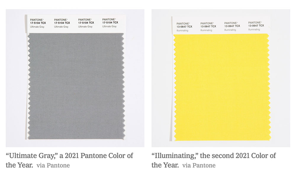
This year, Pantone has picked two opposite but complementary colors to represent 2021. Ultimate Gray and Illuminating. After Living Coral in 2019 and Classic Blue in 2020, this may not be what anyone expected after a “grim” 2020, but it might be what everyone needs. This is only the second time in the 22 years that Pantone has chosen two colors for a color of the year. The first time was in 2015, when Rose Quartz and Serenity were chosen.

That year, the two shades were meant to blend into each other, reflecting the recognition of gender fluidity and social progress. But this year, the two shades are meant to stand on their own, as complementary tones, supporting each other. The gray neutrality can resemble an emotion we have all been feeling for quite some time but the optimistic light at the end of the tunnel can be shared with our Illuminating inspiration.

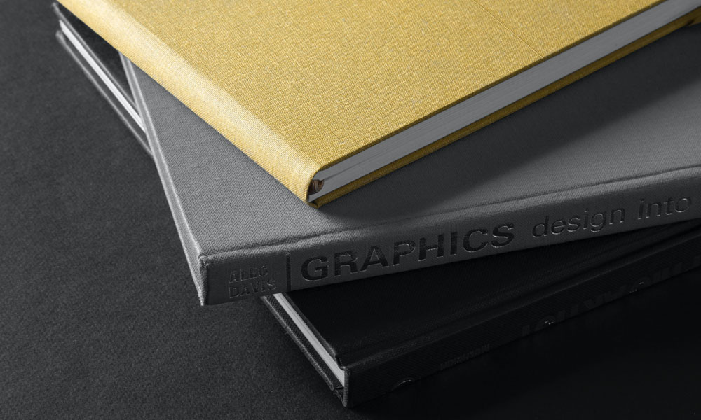
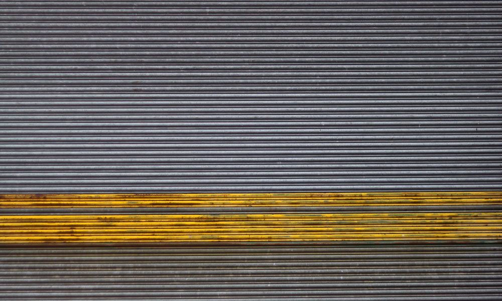
You can use these colors in a variety of ways. Yellow is an energizing color and can be used as an all-over hue or an accent color in areas meant for play or where groups of people gather, like a kitchen or living room. Gray has long worked as an elegant neutral and you can modernize it by adding a soft yellow accent wall in an office or family room.

The brilliance of a light gray is that it works in almost all applications and room functions. Much like white, it is timeless and won’t go out of style. You can switch out furniture, textiles, accessories and art to completely refresh a room without having to repaint. A bright yellow should be used minimally and as an accent, as it can be too powerful and overwhelming in large doses.